How to Mix Wood Tones in Your Home (Without It Looking Like a Mess)
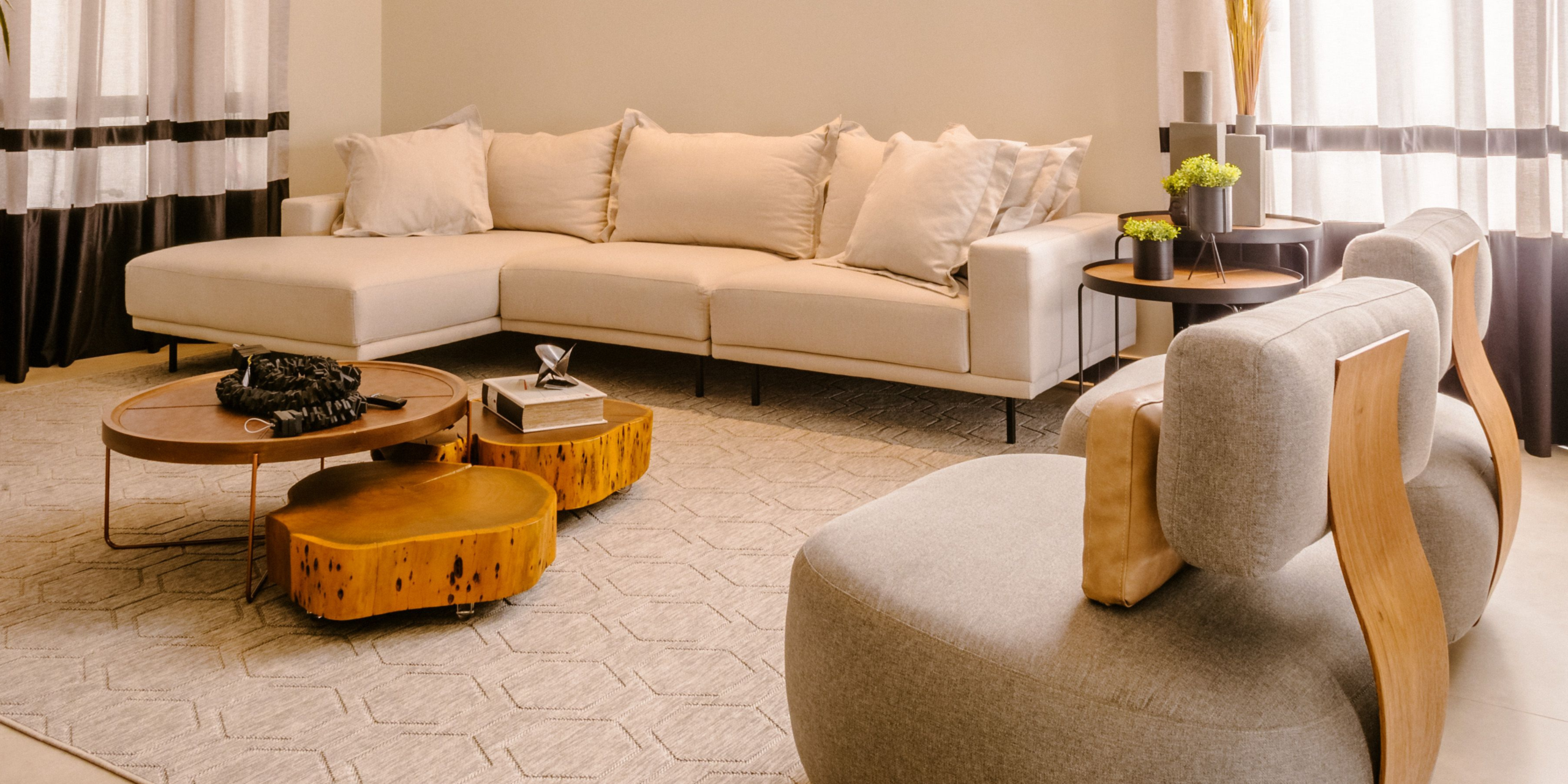
Here’s a situation most Canadian homeowners know well: you buy a dining table you love. Then you inherit a bookcase from a family member. Then you add a coffee table that was on sale. Then you move in with a partner who brings their own furniture. Suddenly your home has four different wood tones and the whole thing looks like a furniture showroom where nothing was curated on purpose.
Matching every wood tone in a room is nearly impossible — and honestly not the goal. The goal is intentional mixing: choosing wood tones that work together rather than fight each other, and creating a room that looks considered rather than accidental.
Designers mix wood tones all the time. The rooms that look best rarely have perfectly matching furniture. What they have is contrast that’s controlled, variation that’s cohesive, and a consistent visual thread that ties everything together.
This guide gives you the exact framework for doing that in your own home — practically and without starting over.
Why Matching Everything Is Both Impossible and Unnecessary
Let’s address the instinct to match first, because it’s where most decorating anxiety about wood tones comes from.
Trying to match every piece of wood furniture in a room to a single identical finish is a losing strategy for two reasons. First, wood is a natural material — even two pieces from the same tree, stained with the same product, will look slightly different due to grain variation, porosity, and how each piece takes the finish. True matching doesn’t exist in the natural world.
Second, a room where every wood surface is identical tends to look flat and institutional — like a hotel room or a furniture catalogue spread rather than a lived-in home. Variation in wood tone is what gives a room warmth, depth, and the sense that it’s been assembled with personality rather than purchased as a set.
The goal isn’t matching. It’s mixing with intention.
The Three-Tone Rule: The Framework That Makes It Work
The most practical framework for mixing wood tones comes from the same principle that guides colour theory: limit the number of tones and establish a clear hierarchy among them.
Limit yourself to three wood tones maximum in any one room. More than three and the room starts to feel visually busy — like competing voices in a conversation where nobody’s listening to each other. Three distinct tones, used in the right proportions, create variety without chaos.
Establish a dominant tone, a secondary tone, and an accent tone.
- Dominant (60%): The tone that appears most in the room — typically your largest piece or most frequently repeated element. The dining table, the primary sofa frame, the flooring, or the bed frame. This is the visual anchor.
- Secondary (30%): A complementary tone that appears in mid-sized pieces. Nightstands alongside a bed, a console table alongside a dining set, accent chairs alongside a sofa.
- Accent (10%): A contrasting tone that appears sparingly — in small decorative objects, a tray, a lamp base, a picture frame. This is where you can introduce contrast without it taking over.
This 60/30/10 distribution isn’t a rigid rule — it’s a proportional guide that prevents any single tone from either dominating too heavily or feeling like an afterthought.
Understanding the Wood Tone Spectrum
Before mixing, it helps to understand where different wood tones sit on the spectrum — because the combinations that work follow consistent logic.
Wood tones run from light to dark along a warm-to-cool axis:
Light tones: Natural pine, ash, blonde beech, whitewashed oak, light maple. These are the palest options — almost honey or cream in colour.
Mid-light tones: Oak, natural mango, light walnut finish. Warm golden-to-amber tones that are the most versatile in the spectrum.
Mid-dark tones: Chestnut, medium walnut, teak, acacia. Warm brown tones with visible grain character.
Dark tones: Dark walnut, ebony, mahogany, very dark stained wood. Deep brown to almost-black.
The warm/cool distinction within each tone: This matters as much as light vs. dark. Oak has a warm, slightly yellow undertone. Ash has a cooler, greyer undertone. Pine is warm and yellow. Beech is cooler and pinkish. Mixing warm-toned woods together works well. Mixing warm and cool-toned woods in the same visible range — a warm golden oak table with a cool grey-ash chair — creates a subtle tension that most people can feel but can’t identify.
The practical rule: stay within the warm or cool family, and vary by depth rather than temperature.
The Combinations That Work
Light + Dark (High Contrast)
This is the boldest mixing approach and the one that most clearly reads as intentional. A light ash or blonde oak floor with dark walnut furniture. A pale dining table with dark-stained chairs. A whitewashed beam ceiling with dark chestnut case goods below.
High contrast works because the brain reads it as a deliberate design decision rather than an accident. Nobody puts a very light piece next to a very dark piece by mistake — the contrast itself signals intention.
The requirement: The tones need to be genuinely different — far apart enough on the spectrum that the contrast is clear. The combination that doesn’t work is two tones that are close but not quite the same: a warm medium oak table next to a slightly cooler medium oak chair. That reads as a mismatch rather than a contrast.
Spread the contrast, don’t concentrate it. Two high-contrast tones sitting directly beside each other — a light oak dining table with dark walnut chairs pulled right up against it — can tip from “intentional” into “jarring” fast, because the eye has nowhere to rest before it hits the next tone. The fix isn’t to soften the contrast, it’s to give it room to breathe. That same light oak table paired with a dark walnut sideboard across the room reads as deliberate layering, because there’s a neutral zone — floor, rug, wall — sitting between the two tones instead of forcing them to compete at close range. As a general habit: if two contrasting pieces are going to sit close together, let a rug, upholstery colour, or a stretch of wall do the work of separating them visually, even when they’re physically a few feet apart.
In practice at Furniture Flip: A room built around the Amaya Light Walnut Coffee Table — with its warm, pale honey-gold tone — pairs naturally with darker chestnut-finish accent pieces. The light walnut as the dominant tone, a chestnut nightstand or side table as the secondary. Far enough apart to read as contrast, warm enough in undertone to feel cohesive.
Medium + Dark (Tonal Layering)
Tonal layering uses tones that are in the same family but at different depths — a chestnut floor with a dark walnut dining table, or a medium oak bed frame with darker chestnut nightstands. This is the most common successfully mixed look in Canadian homes because it feels natural and unforced.
The key is variation in grain pattern and texture alongside the tonal difference. Two pieces in different tones but similar grain will look more similar than they are. Two pieces with different grain scales — one with a tight, fine grain and one with a more open, swirling grain — will read as a deliberate combination even at similar tones.
In practice: The Split Chestnut Nightstand in a rich chestnut finish alongside the Curved Oak Nightstand — which has a lighter, warmer oak-tone finish — is a real-world example of tonal layering done well. Both are solid mango wood so the grain character reads as related, but the depth of tone is different enough to create variation rather than confusion. Used as a pair of mismatched nightstands on either side of a bed, this combination looks curated rather than accidental.
Light + Medium (Soft Variation)
The most subtle mixing approach — light and medium tones in the same warm family create gentle variation that feels almost monochromatic but with more life than a single tone. A light oak floor with medium-tone chestnut furniture. A pale linen-finish storage piece alongside warm mango wood side tables.
This approach works particularly well in smaller Canadian spaces where high contrast can feel jarring and the goal is warmth and calm rather than visual drama.
The Combinations That Don't Work (And Why)
Too-Similar Tones Without Contrast
Two pieces of wood in tones that are close but not identical — say, a warm medium oak table next to a slightly cooler medium walnut chair — look like a mismatch rather than a mix. The eye expects either matching or clear contrast. Anything in between reads as an error.
If you have two pieces that are close in tone, push them apart: stain one lighter or darker, separate them physically in the room, or bridge the gap with a rug or other element that gives the eye somewhere else to rest.
Warm + Cool in the Same Depth
A warm golden oak piece next to a cool grey-ash piece in the same medium-tone range is the most common problematic combination. The depth is the same so the pieces don’t contrast clearly, but the undertone temperature is different enough that they fight each other subtly.
The fix is either to go warm throughout (the most cohesive approach), go cool throughout (less common in Canadian homes but consistent), or exaggerate the depth contrast enough that the tonal difference does the work — very light cool-ash floor with very dark warm-walnut furniture, for example.
More Than Three Distinct Tones
A living room with a pine floor, a blonde oak coffee table, a medium chestnut sofa frame, a dark walnut TV stand, and a mahogany accent chair is not a mixed-tone room. It’s a room that was assembled without a framework. Each individual piece might be beautiful. Together, they create visual noise.
The solution is to pick a dominant tone and make everything else relate to it — either by matching, clearly contrasting, or sitting in a tonal relationship that reads as connected.
The Floor Factor: Your Most Important Variable
Your floor is almost certainly the largest wood surface in any room. Whatever tone it is, it’s your dominant — and everything else in the room is technically mixing with it whether you planned it that way or not.
Light floors (blonde oak, ash, pale maple, whitewashed wood) pair well with both medium and dark furniture. They create a natural contrast with darker pieces, and warm light-toned furniture in the medium range reads as a soft tonal variation. Most contemporary Canadian homes with light Scandinavian-style floors fall into this category.
Medium floors (classic oak, standard hardwood in honey tones) are the most versatile. They work with lighter accent pieces above, darker furniture as primary pieces, or tonal variation across the medium range. The risk is buying furniture in too-similar a tone to the floor — when the furniture and floor blend together, the room loses visual definition.
Dark floors (dark walnut stain, ebony, very dark hardwood) are the most demanding to mix with. Dark furniture on dark floors loses definition. The best combinations with dark floors are lighter furniture that creates clear contrast, or a strategic mix of dark-matched primary pieces with light-toned accents that give the eye a resting point.
Flooring you can’t change: Most Canadian renters and many homeowners are working with a floor they didn’t choose. That’s fine — start from the floor and work up, treating it as your dominant tone and building the hierarchy from there.
The Unifiers: What Ties Mixed Wood Tones Together
The practical challenge of mixing wood tones successfully is giving the eye something that creates visual coherence across the variation. These are the tools that do that:
A Consistent Metal Finish
Brass hardware on a light walnut coffee table, a chestnut nightstand, and an oak console table ties all three pieces together through repetition of the metal accent regardless of the wood tone variation. Brass in particular works across the full wood tone spectrum — it’s warm enough to complement everything from pale ash to dark walnut.
This is one reason why brass hardware has become so prevalent in Canadian furniture: it’s the most versatile unifier across different wood tones. The Manila Gold Nightstand with its brass-plated sunrise drawer front and the 4 Drawer Chestnut Nightstand with its shiny brass knobs both use this principle — the brass reads as a consistent design detail even when the two pieces sit at different tones in the same room.
Black metal is the cooler-toned alternative — works particularly well in more contemporary or industrial-influenced spaces where warm brass feels too traditional.
A Rug That Bridges the Tones
A rug with a colour palette that includes elements of each wood tone in the room acts as a visual bridge. If your floor is light oak, your dining table is medium chestnut, and your chairs have dark walnut legs, a rug that includes warm honey, brown, and deep taupe tones in its pattern creates the connection between all three without announcing it.
This is one of the most powerful uses of a rug beyond its functional role — it’s the piece that makes a mixed-tone room look like it was designed rather than assembled. Check the sizing first.
Consistent Grain Character
When all the solid wood pieces in a room share a similar grain character — even at different tones — they read as related. The natural mango wood grain in Furniture Flip’s solid wood collection, for example, has a consistent organic quality across the light walnut, chestnut, and oak finishes. That underlying grain consistency means pieces in different finishes read as part of the same family rather than competing strangers.
This is one reason why buying pieces from the same material base — all solid mango wood across different finishes, for example — produces more cohesive mixed-tone results than buying pieces from entirely different wood species at different price points.
Warm Neutral Walls
Cool grey walls are a notoriously difficult backdrop for mixed wood tones — the cool grey emphasizes any warm/cool tension between wood pieces and makes variation read as conflict. Warm neutral walls (warm white, cream, warm greige, soft taupe) absorb mixed wood tones and make them read as cohesive warmth rather than a collection of separate decisions.
If you’re struggling with a room where the wood tones feel like they’re fighting each other, check the wall colour before touching the furniture. Warm walls often solve the problem without moving anything.
Room-by-Room Application
Living Room
The hierarchy: Floor (dominant), sofa frame or primary table (secondary), accent pieces (accent).
The living room typically has the most pieces and therefore the most wood-tone mixing to manage. The sofa frame and coffee table should relate clearly — either matching or in a clear contrast relationship. Side tables and console tables can introduce a third tone as the accent.
A practical combination that works in most Canadian living rooms: light to medium oak floor + medium chestnut or walnut primary furniture + light-toned or dark-toned accent pieces. The Amaya Light Walnut Coffee Table as the primary table, darker chestnut storage pieces as secondary, brass hardware as the unifying detail.
Bedroom
The hierarchy: Bed frame (dominant), nightstands (secondary), dresser or chest (secondary or accent).
The bedroom is where mismatched nightstands have become genuinely fashionable — and for good reason. Two nightstands in different tones but the same material family and a shared design language (both solid wood, both with tapered legs, both with brass hardware) look intentionally eclectic rather than mismatched.
The Chestnut Woven Nightstand on one side and the Curved Oak Nightstand on the other is a combination that works: both solid mango wood, different tones, different but complementary texture. The woven front adds textural variation that reinforces the intentional-mix reading.
Browse our full nightstand collection to find a pair or deliberate mismatch that works for your bedroom tone combination.
Dining Room
The hierarchy: Table (dominant), chairs (secondary), sideboard or cabinet (accent).
Dining chairs that don’t match the table are one of the most common and successful mixing approaches in Canadian homes. A medium-tone table with lighter chairs, or dark chairs with a medium table, reads as considered and adds visual interest to what would otherwise be a monolithic dining set.
The rule: chairs need to relate to the table in some way — through material, through metal finish on legs, through the seat upholstery. A visual connection other than tone keeps the combination from reading as arbitrary.
The One Situation Where Matching Still Makes Sense
Built-in joinery — kitchen cabinets, built-in wardrobes, wall-to-wall shelving — is the one context where matching your furniture to the built-in tone makes more sense than introducing variation. Built-ins are architectural elements rather than furniture pieces. Matching a freestanding piece to a built-in creates continuity that makes the room feel more resolved. Contrasting with a built-in introduces tension that can feel unintentional rather than designed.
In all other contexts, mixing intentionally beats matching timidly.
Also worth reading: Mid-century modern on a budget — where wood tone selection is one of the most important decisions in getting the MCM aesthetic right. And mango wood vs. oak vs. pine — understanding the material before you mix the tones.
Take a look at these picks!